Behind the Scenes
Brothers in Arms
December 1, 2005
So, I set to it. Normally I start working on a picture because I have an idea—I want to make something specific, or, more often, a picture I find inspires me. By now, I have a collection of about 1.800 pictures for 'general reference'—when it comes down to it, that's Gay erotica and porn of different explicitness. They are split in three categories—one out of which I definitely want to make pictures, the smallest, then another folder with pictures I really like and think would also make a good picture, and a third, huge folder with the rest. Mind, I only save pictures of which I like at least a small bit, but I save those only for using a part of them, or perhaps when I need a specific situation, e.g. when I want to do an illustration.
If a picture inspires me, I usually see a story to go with it. It need not be something big, just something that could give the impression that there is something going on that fits the characters.
Likely the Coupling fans will now giggle at me, but I try to do erotica rather than porn. For me, the difference lies in intimacy. By that I do not mean cuddly schmoop (although I may draw it at times), but a personal level on that relationship. I try to make that tangible, and I believe having a "story" is the key to that. This is where the third, large category of reference pictures falls short—they are porn. Men, yes, even (some)pretty men, but nothing that gives them spirit.
Now, the problem is that the pictures I sorted into my first category were rather Sparrington-specific. The story I see going with them is Sparrington, and it is not so easy, if not downright impossible for most to replace them with Gillington. And so, I searched again.
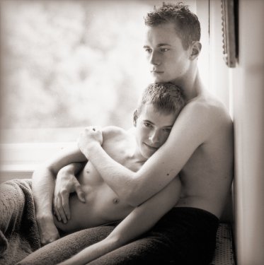
This was the one I chose in the end. I knew I wanted to make them younger, James as a Lieutenant and Gillette as a Midshipman, perhaps. Also I was relieved that it would allow to show Gillette in a front to 3/4 view, because it is very difficult to get proper pictures of him from anything but the short scenes in POTC, and I can't improvise his facial features well. Also, he never quite has this look of quiet contentment I would have thought necessary for using this picture "as is". This was where the "plot" that struck me came in—Gillette being injured. I ended up using this shot:
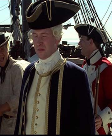
I didn't have much choice between other caps, so this was it. Ironically enough, as soon as I had adjusted the colours, done some smoothing and reshading and added the hair, I was quite content with his look. He was being most compliant in this picture, I only had to do very little re-editing while working on it.
With James I had more choices, because I have plenty of caps of Jack Davenport in various movies and series, not to mention the possibility of making new ones. I ended up with this shot from The Moth:

The strange thing was that once I resized *exactly* that face and gave it a forehead and hair, the nose and lips looked as though they were too big.
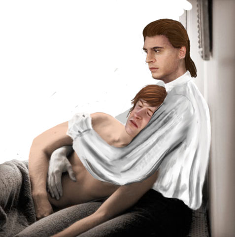
I honestly don't know how much time I spent messing around with James' face. I know I annoyed all my poor online beta victims to no end.
Not to forget that I *hate* drawing folds. Always did. Not to forget that they take ages, because I draw linen with a thin, one to two pixel brush. That is similar to drawing with the point of a pencil as opposed to its side, and creates a completely different texture which I quite like for linen.
Also, I had to colour whatever I used from the original picture, then adjust lighting and hues of all the used elements—for James, that involved redrawing most of his face, and Gillette also needed more highlights and shadows than the original had. While most of my reference pictures are colour, the greater part of the "better" categories are black and white, usually because that is the format artistic photographers use. Mind, colouring itself usually is easy, getting the hues and lighting to correspond a lot more difficult.
In this case, I started out with a generic lighting, because it is the easiest and more usual when there is sunlight involved.

In this case cjk1701—the poor soul has the misfortune of often being online when I need help and being so very helpful that I keep asking—and I quickly realised that this generic lighting is not atmospheric in the least. Therefore, add lantern.
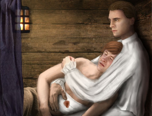
Much, much better.
The shippy background comes from this wood texture I edited to look more plank-like.

I still wasn't quite satisfied with the head, neither was cjk1701, therefore, continued messing as well as some other minor changes, such as slightly different contrast and blending.
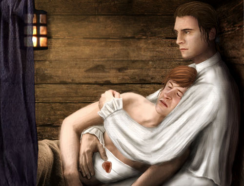
This was when I pounced gryphons_lair for "betaing". She was being most helpful and gave me some great suggestions which eventually led to this, the final product:
Brothers In Arms

Phew... I think that's it! Thanks again for everyone who helped me during the production of this!
